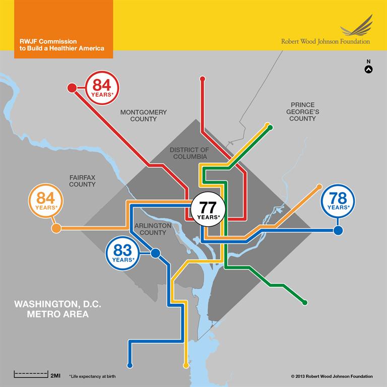
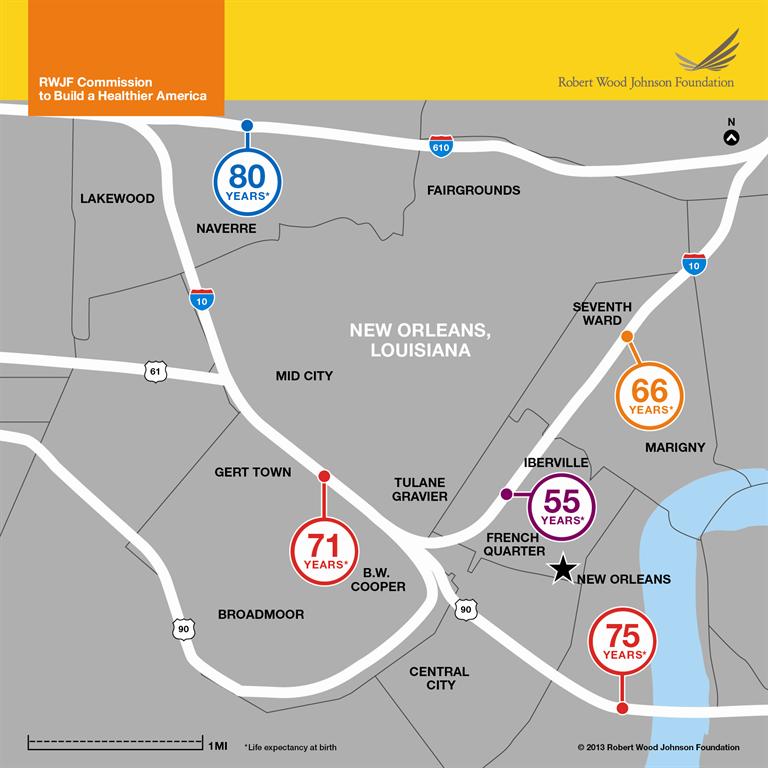
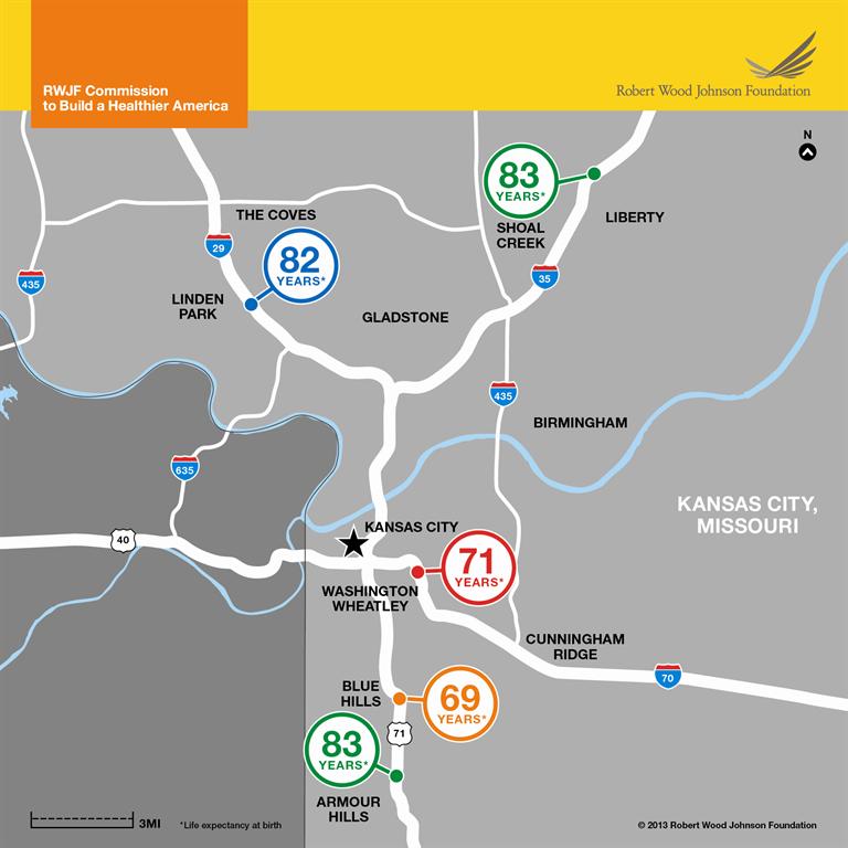
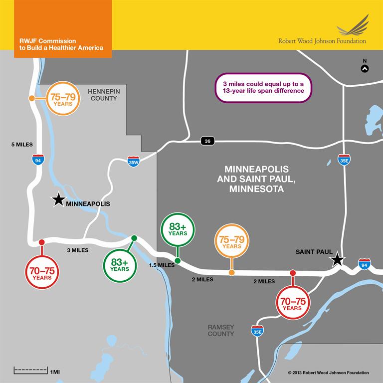
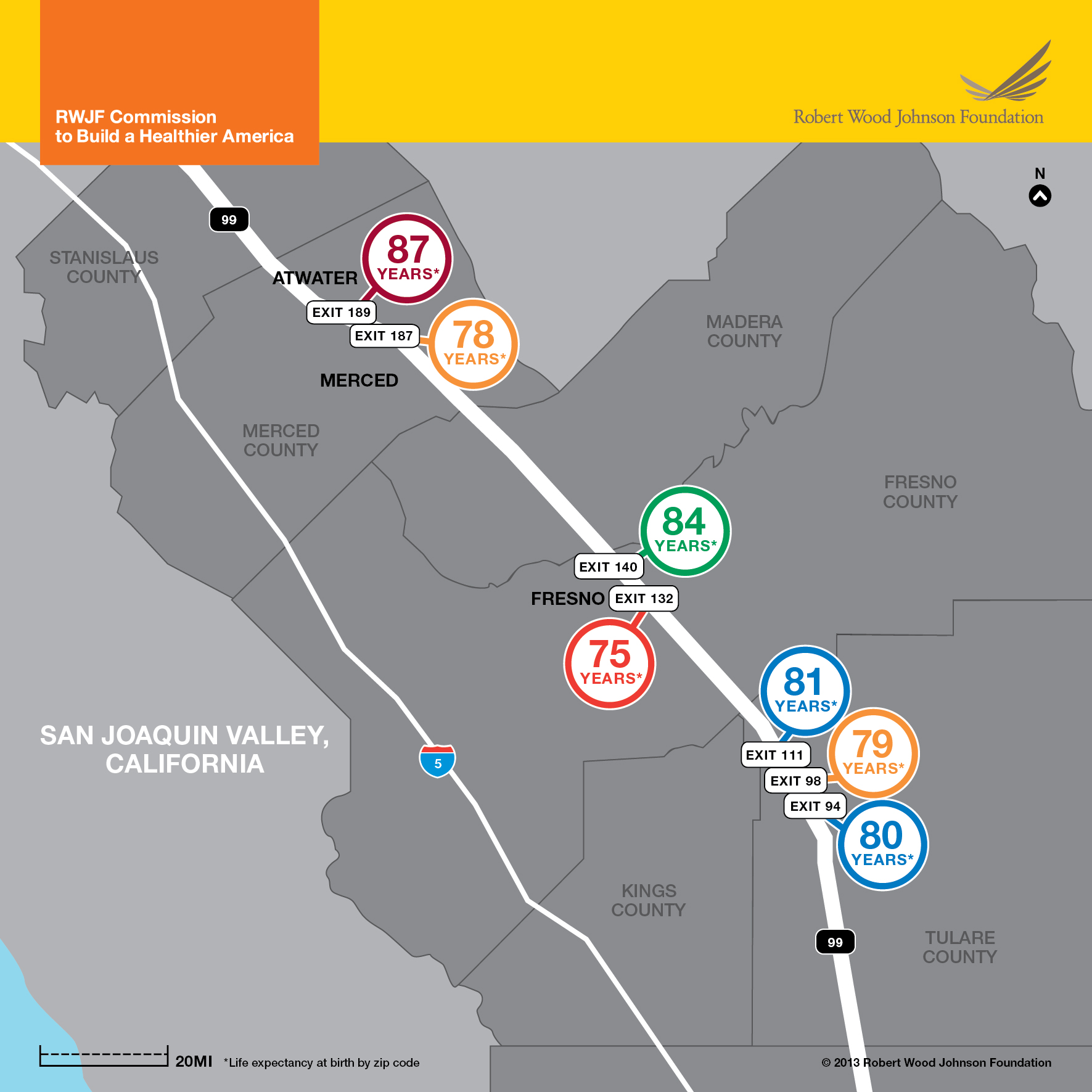
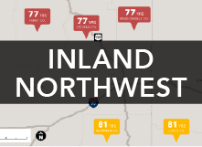
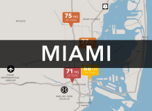
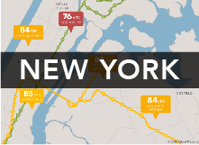
The following series of life expectancy maps illustrate that opportunities to lead a long and healthy life can vary dramatically by neighborhood. In some cases, life expectancy can differ by as much as 20 years in neighborhoods only about five miles apart from one another.
The aim of these maps is to serve as a resource—raising awareness of factors that shape health and spurring discussion and action on a complex web of factors that influence health.
Explore the maps
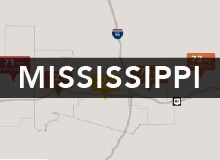
Click each city to view and download the map, explore life expectancy data for other area neighborhoods, and review our methods


Why are some neighborhoods so much healthier than others?
Gaps in health across neighborhoods stem from multiple factors:
- Education and income are directly linked to health: Communities with weak tax bases cannot support high-quality schools and jobs are often scarce in neighborhoods with struggling economies.
- Unsafe or unhealthy housing exposes residents to allergens and other hazards like overcrowding. Stores and restaurants selling unhealthy food may outnumber markets with fresh produce or restaurants with nutritious food.
- Opportunities for residents to exercise, walk, or cycle may be limited, and some neighborhoods are unsafe for children to play outside.
- Proximity to highways, factories, or other sources of toxic agents may expose residents to pollutants.
- Access to primary care doctors and good hospitals may be limited.
- Unreliable or expensive public transit can isolate residents from good jobs, health and child care, and social services.
- Residential segregation and features that isolate communities (e.g., highways) can limit social cohesion, stifle economic growth, and perpetuate cycles of poverty.
To build a Culture of Health—where every person, no matter where they live, has an equal opportunity to live the healthiest life possible—we must improve people’s opportunities to be healthier in the places where they live, learn, work and play.
About the project
To underscore the connection between neighborhood conditions and health, the VCU Center on Society and Health has created a series of maps that prominently display life expectancy values alongside common geographic landmarks such as subway stops and highway exits. The project is supported by the Robert Wood Johnson Foundation (RWJF). The maps illustrate the vastly different health outcomes experienced by Americans living just a few miles apart and serve as a conversation starter about the social determinants of health.
How we calculate small-area life expectancy
The maps are developed using vital statistics obtained from state and local health agencies and population data from the U.S. Census Bureau and the U.S. Centers for Disease Control and Prevention. VCU researchers, along with colleagues nationwide, use these data to calculate newborn life expectancy, or how long a newborn could expect to live based on population counts and death rates for the geographic area in which they were born. For detailed information on calculations in each area, click through the individual city tiles above.
Earlier maps
In 2013, the Center updated a 2008 map of the Washington, DC region and created maps for New Orleans, LA; Kansas City, MO; the San Joaquin Valley of California; and Minneapolis, MN (see below) as part of the work of the RWJF Commission to Build a Healthier America.
Building on the popularity of these maps, in 2014 RWJF funded the Center to develop additional maps for 21 new cities and rural areas of the United States, the first twelve are available at the top of this page.
View the original maps here: